Summer is asleep, and Mom is here. The dishes are done, laundry is folded and toys put away, so we use this opportunity to work on our scrapbooks. Mom is sorting and organizing some embellishments, and I get back to my Biltmore Estate scrapbook.
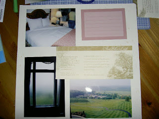
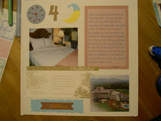
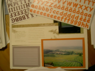
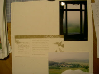 For the layout of my next gold dust page, I start with the two photos that got pushed off my last page (fog and view). I’m not sure if I want to add a picture from the next group of photos or use the other trivia card instead. The trivia card has narrative on it that goes along with the outdoor theme, which is the next set of pictures. Since this will be part of a two-page spread, I decide it doesn’t matter. I use the trivia card on this page and save the extra picture for my next page. (image 1)
I look through all my mementos to see if there is anything else I might want to include. As I’m making notes, I say to Mom, “It’s hard to believe all of these thoughts go into making one page. You don’t realize just how many individual thoughts you have until you write them down.”
I come across a picture Leslie’s 4-year-old daughter Bianca drew for me. Bianca wanted to draw a picture for each of her mommy’s friends that she would be seeing on the trip. I show it to Mom. I’ll be including that later in the scrapbook. I don’t find any more mementos for this page, which makes me even more satisfied with my decision to use the trivia card here.
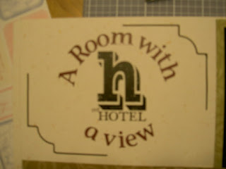
The title for this page just popped into my head: A Room with a View. That literary education of mine comes in handy sometimes! Titles are curious things. It definitely helps to think in terms of catch phrases, well-known titles, clichés, etc. Occasionally, a title will just present itself (like on this page). More often though, it’s the only thing keeping me from moving onto the next page. My best advice is to keep an open mind and let your thoughts flow. Consider all possibilities, even if they seem ludicrous at first. Another thing is, not every page needs a title.
In my search for memorabilia, I came across a few stickers I might use on this page or the next, so I put them to the side.
I decide I’m going to mat the photos on this page with photo mounting paper, so I consult my trusty Cottage Storybox again for just the right colors. I consider my photos. Green is a predominant color in the photos, so I’m thinking of bringing out a more subtle color in the pictures with the mats. I consult the sticker possibilities for accent colors as well. Dark orange seems to be a common accent color in the various elements, so I select that color for one of the mats.
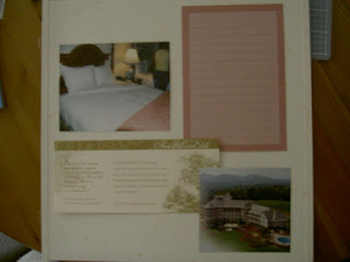
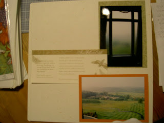 For the fog in the window pic, I choose a chartreuse mat and because the edges of the drapes in the picture are barely visible I use the patterned side of the mat to help soften the boxy look of the window. (image 2)
Mom asks if I took a picture of the wines I purchased while there. “No,” I say, “but I plan to." Then with a chuckle, "I certainly can't put empty bottles in the scrapbook!”
 I turn my attention to the title of the page. I check my supply of ABC/123 stickers to see what colors I have. I consider sassy mandarin but that seems too bright for the tranquil setting of the page. My only other option seems to be classy wine (how appropriate!). I check the colors of the journal boxes in the Cottage Storybox to see if I have a coordinating color. I do, so I select that. I don’t have a lot of journaling in mind for this page, so a small box will work fine. (image 3)
I start thinking about how I want to adhere the letters. Straight? Wavy? Directly onto the page or on a backdrop first? If a backdrop, what backdrop? Wavy would help balance the straight lines of the page, but with no backdrop a lot of awkward “white space” would remain. I have a set of chunky, black, travel rub-on letters. One of the rub-ons is an “H” in a similar serif typeface as my ABC/123 stickers. The phrase “our hotel” is directly underneath the letter. If I rub that onto my page and then wrap the title around it in a circle using the Titletopia, that would add the interest I want. I cut out the rub-on and add it to my layout.
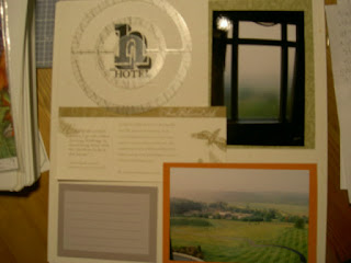 I’m not very experienced with rub-ons. My cousin Stacey is a pro. Too bad you aren’t here, Stacey! I’ll go ahead and give it a try. Heck, I think if I screw up at least I can cover it up with something else! (Back-up plans are wise to have in this craft.) Mom feigns a drum roll, and I rub the icon onto the page. I wish I could close my eyes, because I just can’t look! But I have to look, and, after a few extra rubs for good measure, I lift away the vellum. Success! The image is perfectly adhered. (Stacey, you are right about these things!) (image 4)
Now, I’m ready for the letters. To get them in the right shape, I need to use the Titletopia. I want the circle aligner, so I set that onto the protective backing sheet. This ensures my stickers are exactly where I want them before they even touch my page. The delicate nature of the letters makes it difficult to use my fingers only so I call on my Multi-purpose tool and clips to assist me. (Fortunately, they are unengaged at the present time!)
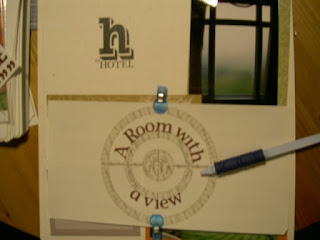 After maneuvering the stickers a couple of times, I achieve the desired result. (image 5)
I lift up the circle aligner from the backing (stickers coming along) and affix the stickers where I want on my page. I press them down and gently pull up on the circle aligner, a little toward me for the stickers above and a little away from me for the stickers below. This allows the letters to separate from the aligner and adhere completely to my page. I finish off the title by adding the dots for my “I”s. (image 6)
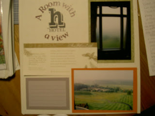 With the title complete, I study the page, and conclude that the excess white space is too much for me to handle, so I try to think up something I could put there without detracting visually from the title. But what? A sticker might be too much, but, still, I keep it in mind. I have a grapes sticker and a leaf sticker that might work. A light bulb comes on. I reach into my CM archives for a border stencil I received as a giveaway for attending an event eight years ago. I play with the various openings and finally decide on on one. Should I place the accent lines at opposite corners of the title or around the entire perimeter? I decide on opposite corners for a couple of reasons. One, there is really only one area of white space that is bothering me (lower left). Two, they won’t create another box shape on the page.
One big question leads to another. What color ink will I use to draw the bordering lines? While I ponder that, I begin adhering the rest of the elements to my page with the Tape Runner (all except journaling box). I include one of the stickers I previously earmarked for the page as well (wine country). I wipe off the photos with my polishing cloth.
It’s about 11:30 pm. Mom is getting ready to leave. She's brought an article about Emma Watson for me to read. We discuss the latest Harry Potter film and book for a bit, pondering whether or not Rowling will write another. I suggest, she’ll write a prequel or start another series. Her fans will definitely want more, even if she is doesn’t. I predict that by summer 2010 will see something else from her. “See you Saturday for Ethan's party,” Mom says, and gives me a hug. I watch her get into her car, then I shut the door and return to my hovel.
 Ink colors. Ink colors. My initial inkling (ha ha, get it?) is to go with purple to match the wine-colored letters. But, then I decide it’s too purple. I test metallic copper and think it would coordinate well with the orange photo mat. I test out metallic patina as well, but, like the purple, it is too green, and I decide against it. Black, as simple as it is, might trump them all. One quick strike onto my scrap paper and I’m convinced. I draw the lines, and immediately feel much better about that irksome white space. (image 6)
The final element of the page is my journaling. When I first started scrapbooking – Kathy will remember – I would write out my journaling separately before transferring it to a journaling box. That’s how paranoid I was of making a mistake. Now, I just think a moment or two about the gist of what I want to say, then I just write it. Nine times out of ten, I have just enough to say to fill my box, nothing more, nothing less. The longer you do it, the more comfortable you’ll get with the pen and the paper.
Since I used black ink on the title area border, I use black on the box, too. Because I described the trivia cards on the previous page, I don’t need to reiterate them here. Instead, I focus on the pictures. While writing, I have to look up a word to double check its spelling. I keep a pocket dictionary at my work table for these occasions. In fact, this dictionary belonged to my late grandfather. Every time I use it, I think of him and silently thank him for sharing his wisdom with me all those years.
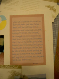
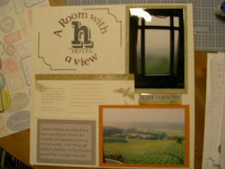 I’m happy with my journaling so I adhere the box to my page with the Tape Runner. (image 7) I wipe my pictures one more time with the cloth, then slide the page protector back on. I add this page to my album, turn the lights out and go upstairs to bed.


