I’ve loaded most of the pages onto Picasa, but selected these few because they illustrate some tips and tricks I wanted to share.
Trick #1 – Make an all-journaling page interesting
+073.jpg)
This page started off as a ruled canvas. Even though the layout has been done for months, I just populated it with journaling this afternoon. I can hear you all groaning. Journaling can be a challenge, and some of you may be thinking an entire page with just writing, yea right. Before you blow off the idea entirely, how many of you spent 15 – 45 minutes recounting a story or anecdote about an event or day in your life to a friend or family member over the phone or in person? I’d be willing to bet a lot. There isn’t much difference in verbally telling a story and writing it down. Your journaling doesn’t have to be eloquent nor qualify for the Nobel Prize nor does it even have to be grammatically correct (gasp!). Yes, that’s right, I am actually encouraging – no endorsing – writing the way you speak. It’s you on paper, and that’s what preserving memories is all about. If you don’t trust yourself to write it in your perfect way the first time, then write it out on another piece of paper or type it beforehand. Put your journaling down first, then develop the rest of the page around it.
For this page, which is the story of how Adam and I met, I typed out the details first. I kind of had to do it this way because I previously laid out the page. I feigned writing the first line onto the black ruled paper by writing in the air just over the paper (hoverpen!) to gauge how much would fit on the first line. I counted the characters including spaces, and concluded that I could fit one full line from the typed text to one full line on the page. However, I had more typed lines than page lines. I began to edit my text for unnecessary words and phrases – or phrases that really didn’t contribute much to the telling of the story. Then, I began writing with the silver metallic pen, editing as I went along. Fortunately, I had enough lines for the words.
I know what your next question is: Isn’t an all-journaling page kind of droll? There are two answers to that question. Yes, to you it may seem kind of dreary con weary because you want to see pictures, mon! But stop for a minute. Imagine what it will be like for your great-great grandchildren to read this witty, insightful passage into your world. It will NOT be dreary con weary for them, I can assure you. They’ll run their fingers over your old, clumsily written words, and feel they are peering through a window beyond which you are the view. Ok, did you get tingles? Because I did!
Ok, now that I’m over that, I didn’t just mean how to make an all-journaling page interesting to read. I also meant how to make it interesting to see. One way to do this is to find a sheet of background paper with a noisy pattern. Place the journaling block over it, so that part of the paper peaks out at the top and bottom. Add a vellum accent to the page (like a callout) to help attract those coveted eyes. Use an eye-popping color of fine-tip ink to makes those same eyes do a double-take.
Trick #2 - Be the next design star with your layout
Sometimes, just putting this here and that there can be kind of drab, right? Background paper, few pictures, journaling box, embellishment. Background paper, few pictures, journaling box, embelli … zzzzppp ….
Rejuvenate your album by creating an entire room or object in which your pictures or memorabilia are merely props. Here are a couple of examples:
+035.jpg)
I had some memorabilia from a production of Hair I saw at Playhouse on the Square in Memphis in October 2001 that I wanted to incorporate on page two of a two-page spread. These included the playbill, my ticket and a fold-out poster of the 2001 – 2002 Playhouse on the Square season. In my stash, I had the sticker border of people occupying theatre seats facing forward as if they were watching a show. I decided to prop up the playbill and poster within a large memorabilia pocket as if they were on a stage. I placed a full sheet of light gray card stock in the background. Then, with my trusty pencil I etched out the dimensions of the stage on dark gray and red cardstock. I trimmed the red into a rectangle with the 12-inch straight trimmer and the dark gray in strips with an angle at the bottom to give the stage depth. Then, I adhered the memorabilia pocket onto the stage, inserted the memorabilia, and embellished with the ticket and two comedy and tragedy stickers (donated by Kathy H.). My final touch was to clip the playbill down on the right so when the page is turned in my book, the playbill won't slip to the left. Ta-da!
+037.jpg)
I had been working on several Christmas pages when I got to this page and was ready for something outlandish. I was willing to gamble. If it didn’t work out, I reasoned, I would figure something else out. I outlined the shape of a Christmas tree with my pencil onto a piece of evergreen cardstock and cut out only the openings for the shape of the branches with the multi-purpose scissors. This became my background paper. I had three vertical pictures to incorporate, so I cut them into ovals with one of the custom cutting system oval patterns and blue blade. These would serve as ornaments for the tree. I cut one slightly larger oval in gold metallic paper with the red blades. I adhered the ovals and pictures with tape runner. Using an eyelet setter, I created holes for gold eyelets at the top of each picture so they would look more like ornaments. (Incidentally, I also thought about putting ribbon around them, but didn’t have the right colors at the time.)
To further trim the tree, I punched white, french vanilla and cranberry circles with the circle maker and mini circle maker. I pieced the white and french vanilla together with frosted splits to make little popcorn and alternated the popcorn with the cranberries to make a primitive-style garland. I added a few sticker ornaments from my stash, and using the same oval patterns cut strips to fit around the picture ornaments for captions.
Trick #3 – Mix it up with a split page
Have you ever had multiple good shots of the same subject but not sure what to do with them? Looking for a unique way to create an intro page or title page? Try your hand at this little twist.
Mark a regular refill page (in my case their 12 x 12) at the centermost point. Be sure to include the reinforced edges in the measurement. Trim the page at the mark with the 12-inch straight trimmer. Add tape runner to one side of one of the halves then place the other half over top and press together. Be sure the page loops are on one side and the curved reinforced edge is on the other. You can protect the page by trimming a page protector in half. Now you have a cute double-sided insert!
+047.jpg)
+048.jpg)
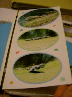
These are extra pictures of alligators we took when we went to visit my grandparents at their home in Wildwood, Florida in 2002. Using the custom cutting system oval patterns and blades, I cut all but one picture into an oval shape and also cut a background for each. Then, using the meadow micro maker, I punched shapes of a frog, fish, butterfly and flower to embellish.
+051.jpg)
+052.jpg)
During the same trip, we visited Epcot Center. I had quite a few pictures for this side trip, so I wanted to create an interesting intro. I professionally cut the letters to spell E-p-c-o-t. I also selected an image from my library that resembled the Spaceship Earth. I cut the foreground in gray card stock and the background in brick card stock. I placed one picture on this side of the split. On the reverse side of the split, I used a few random shots that identified Disney and Epcot Center. I charged two of the pictures with aquamarine photo mats and added a strip of mediterranean card stock to the left.
Look for Turning Tricks Part 2 within the next few months!
To further trim the tree, I punched white, french vanilla and cranberry circles with the circle maker and mini circle maker. I pieced the white and french vanilla together with frosted splits to make little popcorn and alternated the popcorn with the cranberries to make a primitive-style garland. I added a few sticker ornaments from my stash, and using the same oval patterns cut strips to fit around the picture ornaments for captions.
Trick #3 – Mix it up with a split page
Have you ever had multiple good shots of the same subject but not sure what to do with them? Looking for a unique way to create an intro page or title page? Try your hand at this little twist.
Mark a regular refill page (in my case their 12 x 12) at the centermost point. Be sure to include the reinforced edges in the measurement. Trim the page at the mark with the 12-inch straight trimmer. Add tape runner to one side of one of the halves then place the other half over top and press together. Be sure the page loops are on one side and the curved reinforced edge is on the other. You can protect the page by trimming a page protector in half. Now you have a cute double-sided insert!
+047.jpg)
+048.jpg)
These are extra pictures of alligators we took when we went to visit my grandparents at their home in Wildwood, Florida in 2002. Using the custom cutting system oval patterns and blades, I cut all but one picture into an oval shape and also cut a background for each. Then, using the meadow micro maker, I punched shapes of a frog, fish, butterfly and flower to embellish.
+051.jpg)
+052.jpg)
During the same trip, we visited Epcot Center. I had quite a few pictures for this side trip, so I wanted to create an interesting intro. I professionally cut the letters to spell E-p-c-o-t. I also selected an image from my library that resembled the Spaceship Earth. I cut the foreground in gray card stock and the background in brick card stock. I placed one picture on this side of the split. On the reverse side of the split, I used a few random shots that identified Disney and Epcot Center. I charged two of the pictures with aquamarine photo mats and added a strip of mediterranean card stock to the left.
Look for Turning Tricks Part 2 within the next few months!


0 comments:
Post a Comment
Talk to me. Tell me what you think! Got a burning question? Ask me!