It's another get-my-stash-out-of-hiding session. It'll be a few weeks before my next self-hosted event (Mar 22 - Crop Till Ya Drop - be there or be square), so I have time to comfortably spread out and get some more cropping done.
Mom is here. She just finished going through the new Creative Memories spring/summer catalog, marveling at everything that is changing. For those who don't know, CM now boasts true 12 x 12 pages, albums, and power palettes, so everything is interchangeable with other scrapbook suppliers.
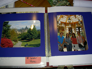
Before I begin working on my next page layout, I contemplate what to do with the keepsake photo of Jennifer, Leslie, Shannon and I inside Biltmore House in front of the Winter Garden. My goal is to incorporate it into the album seamlessly so no one perusing it has to fumble with pulling it out of a sleeve yet can still view it in its original form.
Kathy H. recently suggested that using ribbon I could somehow bind it to the ruby album. I run upstairs and rummage around in my wrappings "organizer". I quickly locate some gold and burgundy ribbon. Back downstairs I secure the gold ribbon around the picture (burgundy was too short), tie a knot and slide the picture + ribbon over the album binding. I open/close the picture-folder a few times, then slide another original 12 x 12 page over it. Everything fits beautifully and the pic-folder opens with such ease! Kathy, GINORMOUS props to you for this fabulously creative idea! (images 1, 2, 3)
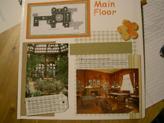
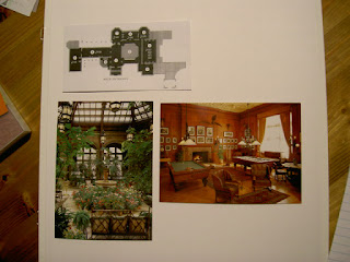
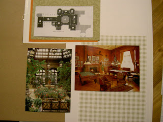
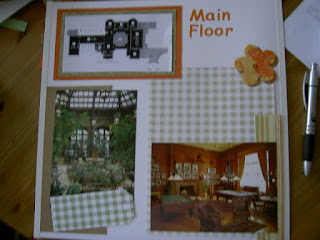
Since the next part of the album is the tour of Biltmore, some of it will be illustrated with postcards, some with photos (because we weren't able to take photos inside). The first page is the main entry. I previously copied the as-builts from the tour program, so I start by cutting the as-built of the main floor and add that to my layout. (image 4)
Since I'm using an original white 12 x 12 page, I'd like to create a background or mat for it. I consider using a double mat with two sheets from the Cottage Storybox. I also consider a single mat for the as-built and postcards with a sheet of background paper. Because the postcard images are quasi-busy, I have to be careful the print on the background paper doesn't trump the postcards.
While the various papers jockey for position on my page, I inadvertently knock my glass of wine over and it splatters up the wall and into Charlie's dishes below. Reacting quickly, mom grabs some paper towels, and I wipe up what I can. I rinse and wipe out Charlie's bowls lest he get a little drink in him and start howling at the moon. (Now, that I think about it, maybe it would actually silent his incessant barking.)
When I return to my page, I'm not closer to selecting paper for my page but the aroma from the spill is wafting around the room and into my nasal passages, sending me into reverie about our aventura de vino, an a propos inspiration for my work.
The palette will most certainly be earthy. (Too bad I don't have the new Earthy Power Palette yet!) I find a sage-checked paper that will help bring out the green felt on the pool and carom tables. I also decide on a woodsy brown to backdrop the winter garden. I may use the same woodsy brown to deliver the title "Main Floor." (image 5)
Unfortunately, the lingering aroma of the Woodbridge White Zinfandel isn't enough to keep me awake, so I bid Mom adieu and head to bed.
[Sunday morning and afternoon, February 24]
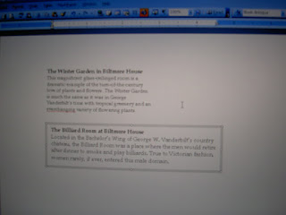
I've been randomly visiting my scrapbook area this morning hunting for various paper and other papyrus embellishments. (It's akin to grazing and meandering about a party buffet.) I ultimately decide to use vellum to print out some of my journaling, which primarily comprises the descriptions on the reverse side of the postcards.
After Adam leaves for work, and I put Summer down for a nap, I set to work. Because I want to conserve the vellum (printing only once), I carefully space out each passage, so I can fit several onto one sheet of vellum. For the first two, I measure the areas where I'll adhere the vellum, then in MS Word, I create text boxes to fit those specs. Then, I play with fonts and font size, finally choosing Book Antiqua. (image 6)
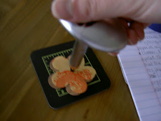
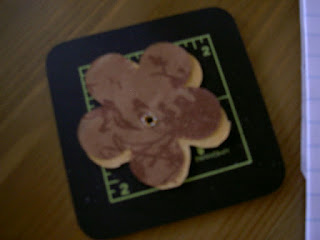
I decide to add numbers in the journaling boxes corresponding to the numbers on the as-built. I save the file and return to the page layout. I adhere everything else with tape runner. I happened upon a specialty paper in my stash with orange hues and one with brown hues, both flower-shaped. I decide to attach them together with an eyelet. The eyelet will make the entire floral embellishment appear that it is secured to the page with the eyelet itself. I have a silent setter (convenient when Summer is napping - otherwise it would sound like Handy Manny's tools inhaled a little too much sawdust). I adhere both "flowers" together with tape runner. Then, I make the hole using one of the cutting attachments on the setter. (image 7)
I place a brown eyelet in the hole, turn the entire embellishment over and using the setting attachment that corresponds to the hole, force the eyelet backing into "wings." (image 8)
Before I adhere this to my page, I turn my attention to the title. The position of that will affect where I place the floral embellishment. I don't have any clover, pistachio or mandarin ABC/123 stickers open, so I go upstairs to retrieve a set of each. Ivy would probably be best but I don't have any on-hand (mental note to order some). Pistachio proves too soft. Clover doesn't coordinate either. So, the verdict is mandarin.
To place the letters evenly, I use the Titletopia Circles & Banners aligner along with the multi-purpose tool and clips (see Favorite Page and Favorite Tool for how-to recap). With the letters/title adhered, I place the floral embellishment. The final element will be journaling, which I may do later or after my next layout. Haven't decided. (image 9)
Mom arrived some time ago and is trying to determine what color letters to use on a bright blue background paper. She is working on a two-page spread. The other page with pink on pink-checked paper. Her choices are royal blue, bubblegum or black. None of those seem to work, so I suggest yellow, which she has, but she asks to see what else I have. I show her an array, and she selects blueberry as well as a few others.
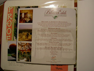
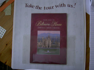
My next page is simple. I adhere a sheet of background paper and using one of the large memorabilia pockets, I display the tour program guide. Both the small and large memorabilia pockets afford the inclusion of memorabilia that we don't want to permanently adhere but still wish to incorporate into our albums. The title for this page will be "Take the tour with us," and I'll be using ABC/123 stickers in wine. (image 10)
I stop here for now. Summer will be waking soon, and I need to start dinner.
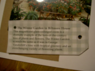
Once Summer has had her bath and is in bed for the night, I print the vellum with journaling descriptions and finish the first page I started. I cut the first vellum box to fit a green-checked tag I had previously reserved for this page. I adhere it with frosted photo splits so the adhesive "disappears." I use the silent setter cutter attachment to "punch" a small hole where its outline is on the tag. Then, adhering 3-D dots, I affix it to the page. (image 11)
I cut the next piece of vellum to fit the space just above the billiards postcard. Same as the previous piece, I adhere it with frosted photo splits. I wanted to handwrite the unborrowed journaling for the page, so using the leftover strip I cut from the green photo mat, I scribe re: this part of the tour. I choose the copper metallic fine-tip pen b/c it ties the color scheme together. I adhere the strip to the page with tape runner and slide the page protector on. (image 12)