Before I enter my latest post on the Biltmore album, I must sing the praises of a little-known scrapbooking method that has allowed me to complete a whopping 40 pages in my 2001-2002 events album the last month. Shocking, isn't it? Many of you who are familiar with the rate at which I normally complete my albums are surely impressed. The process is called the Power Layouts method. It can be described as an assembly line of sorts. Basically, it involves first culling all the elements of a page: the paper, photos, mats, journaling boxes, embellishments, etc onto a faux page (i.e., plastic with indented guides for different size pages). Following that, cutting, punching and journaling, then setting the faux page to the side to move onto the next page.
One session, I put layouts together. The next session, I paste everything down. I've found the reason why this works for me is because when I'm putting the layout together in the first step, I don't have to commit to my decisions until the next session, so I'm free to move on without second guessing! Who knew I was such a commitment-phobe!
At any rate, I highly recommend the
Power Layouts method. As if on cue, CM has just introduced a new
Power Layouts kit for the new true 12 x 12 and 8 x 8 sizes. It's available in the New Products section under Organizers on my
website.
I'd actually started using this method early last year, but didn't get around to pasting some of the pages down because I was waiting for some pictures for the event that go in the front of the album. For some reason, I felt that I had to put the album together in consecutive order. How silly of me! It's simple enough to mark a blank page with a flag reminding myself what it's for and go back to it later! Don't let missing photos hold you up, either! Break free! As Dr. Phil would say, "You can't change what you don't acknowledge."
I'll post some pictures of this album on an upcoming blog entry. For now, I'll rewind a couple months to catch you up on my Biltmore album.
[Wednesday, July 16, 2008]
We've been enjoying a nice respite from work this week, and despite staycating, I've finally had a chance to work on my scrapbook. The week of staycating (i.e., using time off work to stay at home) has been fun. We went to St. Michaels and, while there, visited the graves of my great-great grandparents. We saw Body Worlds, ate crabs and took Summer to the playground. In short, we stole some time from the world. Unfortunately for Adam, the week wasn't all pleasantries. Early on, he jammed his middle toe against one of Summer's toys, which, at the very least, broke a large blood vessel and, at the very most, sprained it. We've both had our bouts with toe torture over the last year. Read about mine in a
previous post.
For this page in the Biltmore album, I know I want to mimic the diamond pattern from the
previous page. While I'm considering my options, Kathy wants some professionally cut letters in gold for her Shamrock Fest two-page spread. After I cut the letters, Kathy isn't sure if the letters should be split by word or split evenly. We concur - evenly. We chit-chat about Facebook, the new
90210 series and her going back to school.
I take a short break to read a few books with Summer and help Adam get her ready for bed. I am so delighted about her interest in books. She has the most amazing memory. After reading a book once or twice and pointing out various things, we often ask her questions about the pictures, and she remembers! We have books on each level of the house just for her: a dresser drawer full in our bedroom, a basket full in the living room, and a shelf full in the basement. (Since we've been potty training, we also have a few strategically left in the bathrooms.) She loves to pick them out and has recently started requesting them by title. Among her favorite books: The Belly Button Book by Sandra Boynton, Babybug (which she affectionately calls "Kim and Carrots"), Clarabella's Teeth by An Vrombaut, The Tiny Star by Arthur Ginolfi, and, of course, Mommy's scrapbooks!
Once Summer is down for the night, I return downstairs. Kathy has another question about her spread: would the letters look better vertically or horizontally? Definitely horizontally; they don't fit as well vertically. Then, I suggest she use the two leftover pieces of gold as photo mats, one on each page to tie the punchy color together. Her next mission: labels for pix of bands. Star maker? Galaxy micro maker? I find a stencil with a star, so she uses that with the gold remnants to caption her pictures.
Returning to my page, I'll have room for a title on this page, but I'm not sure what it will be yet. One of the only pages of the tour inside Biltmore House contains pictures. Both of these pix have plants in them so I'd like to try to mimic that somehow using various shades of green cardstock.
Kathy packs up her stash and I walk her to the door. She has a long 3-minute ride home!
When I return to scrapbook, the mood and motivation have evaporated, so I decide to pick it up again tomorrow.
[Thursday, July 17, 2008]
I make two palm-like branches out of evergreen and honeydew cardstock. With a pencil, I lightly draw a stem in the direction the palm will grow. Then, using the multi purpose scissors, I snip the paper into leaves. (image 1)

The light green one seems too light, so using the green round-tip pen, I color in some of the leaves. (image 2)

I'm not too thrilled with the result, so I cut another palm in a more traditional green cardstock. In order to make the leaves seem more natural, I snip some in half and at mid-length. I also randomly cut the ends of some leaves so they don't appear as fabricated. With the multi-purpose scissors, I also cut a shape of a stone pot out of the remnant of clay cardstock. (image 3)
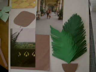
Satisfied with the embellishment, I happily move on to rest of the page.
Okay, so it was a long break, and no I wasn't eating crabs the whole time! That's the beauty of staycation - nothing to do and all day to do it! Although, we are leaving for the beach in an hour, so I'm trying to finish up this page.
First thing I want to do is the title. I don't have any ABC/123 stickers downstairs, so I go upstairs into the office and search through my stash. I pull everything out that's green. I have 5/8" Sassy in clover, 5/8" Classy in pistachio, and 3/8" Classy in ivy. I lay all of these on top of my page. Right away, I see the pistachio will be too light. Because my title "Taking a Break" will need to fit around the diamond, I opt for the 3/8" size in ivy. Because the diamond will act as my "aligner" I don't need to use titletopia but I will need the multi-purpose tool. (image 5)
To ensure the letters are spaced evenly, I count letters and start with the ones in the center of each line. When counting, I'm careful to include spaces. (image 6)
Next, I focus on journaling. Picking the right ink color is often challenging. In part, it's from having so many fine-tip pens! I test the five candidates on a scrap piece of the clay cardstock I'll be using. Green is out (too bright). Purple, plum and cocoa blend in too much, so olive wins! Plus it coordinates with the ivy ABC/123 stickers I used in the title. (image 7)
To finish off the page, I free draw the design from the balcony wall in my picture onto a scrap of clay cardstock, cut it with the multi-purpose scissors and adhere with tape runner. To fill the space in between the title, I professionally cut a clock in honeydew cardstock and adhere with tape runner. I wipe the pictures with my photo polishing cloth, then slide on a page protector. (image 8)


 Posts



