After clean up and and some time spent with Summer before her bath and bedtime, I'm ready to continue working on the Biltmore album. Mom - my official scrapbooking buddy - is here with me. She is no longer a virgin scrapbooker, and, after spending many months organizing her stash, she completed 4 more pages today during the crop! "You are officially hooked," I say. "I watched you grazing around our scrapbooking table, your mental wheels turning with ideas and anticipation for applying them to your next pages." She quickly agrees, and, with that, we sit down to start another session.
For the next page in the Biltmore album, I have picture choices to make. There are nine pictures in this group, which include our walk from the Inn down to the Winery after breakfast. I anticipate that these pictures will probably comprise the next three pages. There is one duplicate, however. When using my 35 mm camera, I sometimes take two pictures of the last exposure on a roll, not only in the event it is one of those half-exposed frames but also to help me keep the rolls in the proper order.
I might be able to get all of this pictures into two pages. It depends on if I do any cropping or not, which generally if I do, it is not much. I start with the first three pictures and check my stash of memorabilia. I consider a postcard of the 70-acre vineyard as well as an image of a breakfast table from one of my brochures. Turning my attention to stickers and other embellishments, I note that I have a 3-D sticker of a vineyard, a background paper with a vineyard that I could use as background, and a couple epoxy stickers with appropriate phrases. I group all of these items together before I start the page much like Candice Olsen from Divine Design (on HGTV) collects all of her inspirations, textiles, etc. into a wire basket before sketching anything.
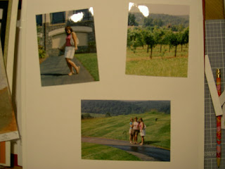
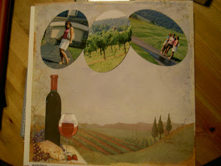
 With the personal trimmer, I crop a little of my photos out, not much, just a little excess sky and ground (image 1). I consider ovaling two of the pictures with the oval cutting patterns, and, for a brief moment, think that a trio of these would make a nice "cluster" of grapes. I fear that the grandeur of the landscape might be lost if I do that.
  After a bit of contemplating, I decide to go for it anyway because it would be a nice effect. If I don't like it, I reason, I have two more copies of each picture, and I can start over! After completing the oval cuts with the custom cutting system mat and blades, I decide it was a good move (image 2).
At that moment, Mom blurts, "Oh no, I made a mistake!" In filling a family tree page, she incorrectly wrote a name in one of the spaces. Her page is a light green color, so the write-again correction paper won't work. Thinking for a minute, I say, "You can cut some green paper - a slightly darker shade than the page would be fine - the same shape as the openings, and place the strips over the spaces for all the male names. This way, it would look uniform and like you intended to do it that way." She likes this idea, so we hunt for an appropriate color of paper. I have some in my scraps stash, so she measures and uses that. "I have multitude of solutions up my sleeve," I say, "only because I've made so many myself!"
Back to my page, I trim the background paper using the 12-inch straight trimmer and custom cutting system mat and blades. I start thinking layout again and wonder how I can mimick stems and leaves for my "grape" pictures using paper and pen. I check my stash of green and brown paper. I have a sheet of green that could work for a leaf or two, but I quickly determine that the leaf would obscure the pictures too much, so I nix the leaves idea. The branch idea would work well, though, so I hand tear a strip of paper-bag brown paper to place at the top of the page above the photos.
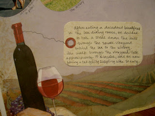
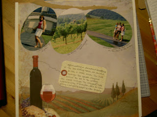
Since this page is already "busy" with the background paper, I save the other embellishments for the two upcoming pages. Now, I think journaling. I don't have much journaling to do about the actual walk, just where we'd been and where we are headed. I can make little annotations of each picture under the pictures. I find the perfect journaling box that looks like a tag but with a worn texture. I scribble my thoughts on it with a black fine-tip pen from the basic set (sadly, neither Mom nor I have sugarplum, which would have been perfect). Now, I'm ready to adhere everything.
 I add a string from the bottle to the tag with the black fine-tip pen. I add a few captions to my pictures and this page is history (images 3 and 4).
Aside: In the first picture, you might have noticed a slight imperfection on the
 reinforced edge of my white refill page. Part of it tore some day ago when something with a sticky backing accidentally landed there and I tried to remove it. To conceal the tear, I place a strip of write-again correction paper on it to hold it down and now it's barely noticeable. If you didn't notice, then my trick worked, but I still wanted to share the tip!


1 comments:
This is my favorite page so far!
Post a Comment
Talk to me. Tell me what you think! Got a burning question? Ask me!